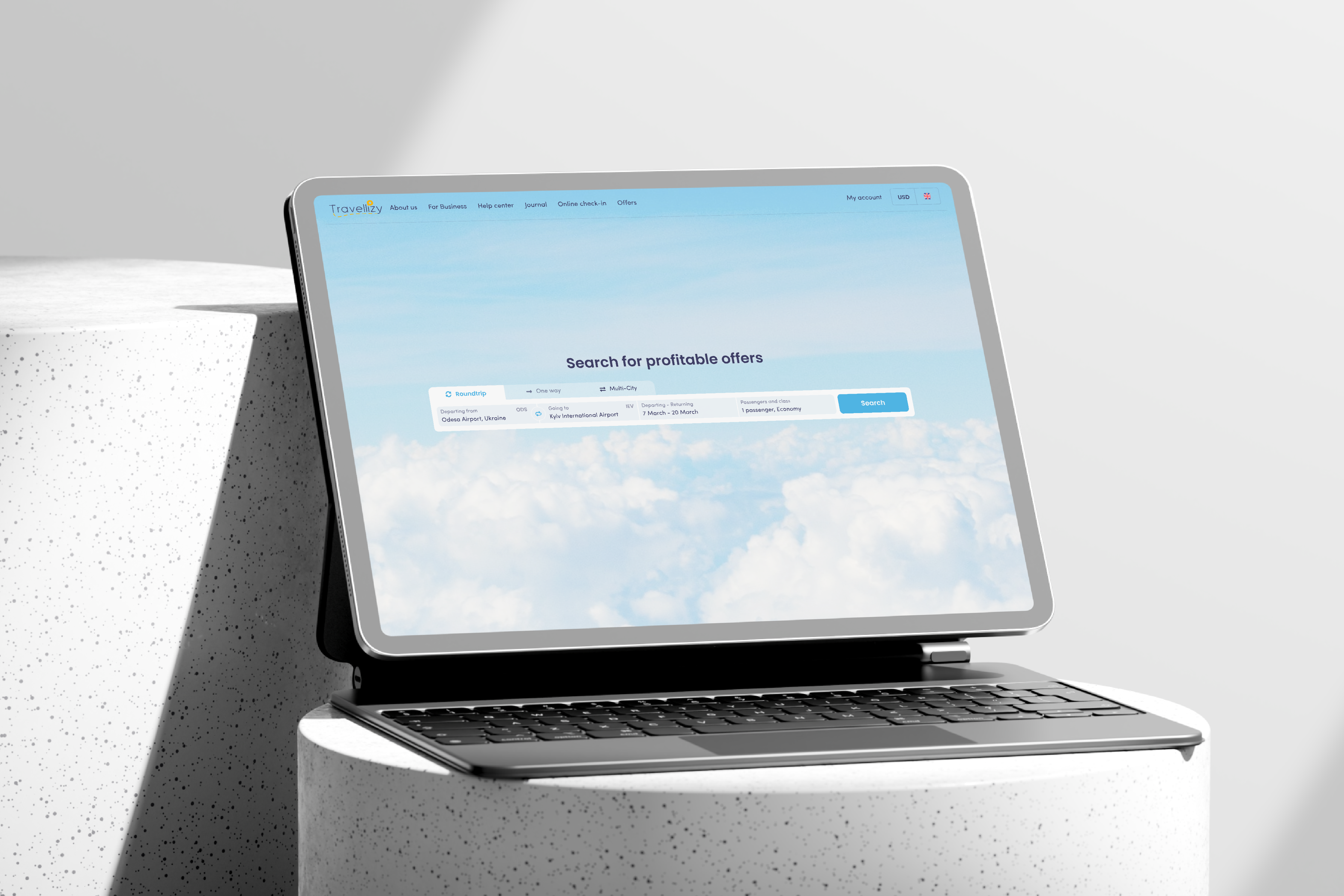
Redesigning the login and signup experience for a travel booking platform — reducing friction, increasing conversions, and making onboarding fast enough to not get in the way.
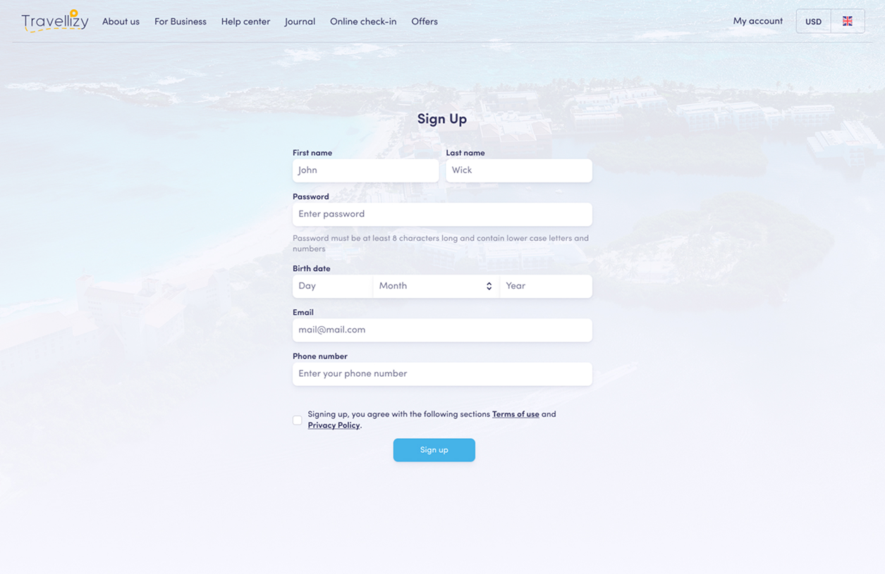
The registration form had 9 required fields — and most users never finished it.
Completion took over 2 minutes, with a 70% drop‑off rate and a conversion rate sitting at just 2.5%. The platform also needed to collect extra details — phone number, country — without making the form even longer. At the same time, a new social network and travel blog were being added, which required a smoother, faster onboarding path to actually get users in.
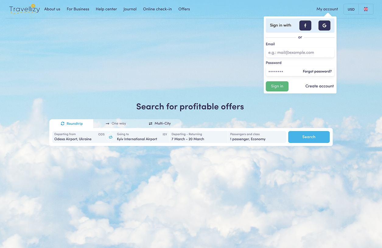
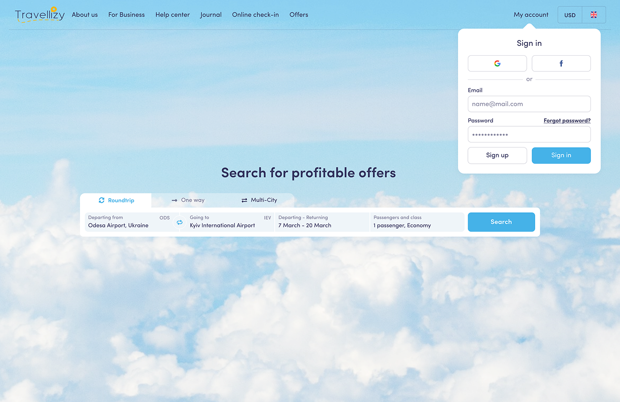
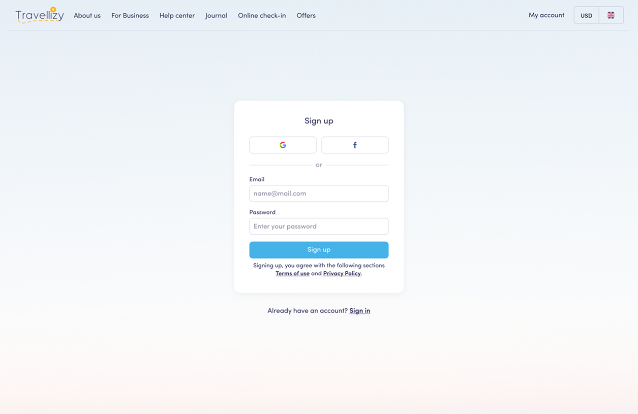
Cut the form down to 3 fields and moved everything else out of the way.
Email, password, and name — that's it. Country and phone number moved to profile settings. Social login via Google and Facebook gave users an even faster path in. Progressive disclosure ensured extra fields only appeared when actually needed.
Down from 9 to 3 required fields — email, password, name. Secondary data deferred to profile settings
Google and Facebook login added as fast‑track options, bypassing the form entirely for most users
From 130s to 40s — users complete sign‑up before losing momentum
From 70% to 25% — fewer users abandoning mid‑form
From 60% to 35% — more users staying after landing
From 2.5% to 15% — six times more sign‑ups